PFL CHICAGO.

Role: Art Direction. | 2026.
Deliverables: Branding, Marketing materials, Digital/social assets
OVERVIEW.
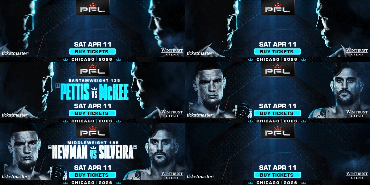
PFL Chicago called for a visual identity that captured the distinct atmosphere of the city while giving the event a look of its own. Inspired by Chicago’s cold weather and its identity as the “Windy City,” the campaign took on a darker, colder aesthetic. Icy blue tones, dramatic lighting, and atmospheric textures helped create an identity that felt connected to Chicago without relying on traditional city imagery.
CREATIVE DIRECTION.
The creative direction focused on capturing the feeling of Chicago through color, lighting, and atmosphere rather than recognizable landmarks. A color palette of icy blues, black, and white established the foundation, while cool rim lighting and atmospheric movement reinforced the cold, windswept aesthetic. The result was a cinematic visual brand that felt distinctly Chicago while remaining grounded in the PFL identity.
THE CHALLENGE.
Limited photography for the main matchup presented an additional creative challenge. The strongest available image for one of the opponent's was only a side profile available in black and white, which helped inform the campaign’s monochromatic photo treatment. Rather than working against the limitation, the black and white imagery became part of the visual direction, with cool blue lighting helping unify the fighter photography and reinforce the campaign’s cold atmosphere.
THE WORK.
Animated End Cards

9:16 Social

1:1 Social

Matchups


Email Assets

Email Hero Image:
Footer:
Pre-Sale Landing Page

Social Assets


